What's in a Logo?
What’s in a logo? More than a pretty bauble, but less than a definitive descriptor. To misquote Shakespeare, a destination by any other emblem would look just as sweet. A logo doesn’t affect the product quality; but it can aid recognition. Australia’s recent announcement that it is to retire the trusty old kangaroo and replace it with a ‘hearty, resilient’ wattle (I didn’t know either – read on) has prompted this blog, which considers the role, value, and critical elements of a national logo.

Admirable Ambitions
Australia’s new logo has been developed by the Nation Brand Advisory Council. The very existence of this organisation, established by former Prime Minister Malcolm Turnbull, shows a forward-thinking approach in an attempt to create an over-arching national brand for all things Australian, from trade to tourism – similar to the pioneering New Zealand Way, which united a range of different sectors under one approach around thirty years ago. Probably the most respected nation-branding exponent worldwide, New Zealand has continued to build on this trailblazing initiative over the years, with different sectors adapting it to fit their own purposes as time has gone by. Many countries have tried to emulate New Zealand’s success, but few have succeeded in uniting their major economic sectors behind a nation brand to achieve such impact.
One thing that is clear from most nation-branding efforts is that tourism is often a key driver of a country’s global image. This is because international audiences tend to be exposed to destination marketing messages far more than messages from any other sector that talks about the country beyond its borders. Consequently, tourism should usually be central to strategic deliberations about the way a country is projected.
Effective nation-branding depends on synergy between tourism, trade, finance, education, culture, entertainment, sport, diplomacy, and all other sectors that project the country to international audiences. Finding a common, nationally unifying thread, while still allowing each sector the flexibility to target its own distinct audience with its sector-specific messages, is the elusive, high wire act few ever attain successfully.
At the risk of waving a red rag in front of a bull, success means following in New Zealand’s footsteps; failure is likely to result in years of lost opportunity.
Great Expectations

Too many tourist boards and development agencies get hung up on the elements of a logo, as if it had some shamanic power. All too often they focus on a logo at the expense of their destination’s enduring brand values, which are the lifeblood of its competitive appeal. I have seen too many misplaced displays of blind faith in a logo’s ability to transform the image of a place, as if it were the Holy Grail of marketing magic. It isn’t.
The notion of using a logo to shift perceptions is as ambitiously misguided as trying to dislodge a boulder with a feather. It’s merely a small weapon in a large marketing arsenal – a signpost to, but not a comprehensive descriptor of, a destination. But, once they have a logo, all too often some then fail to appreciate the recognition value it amasses over time and seem alarmingly happy to change it with the corporate weather.
So, how does a logo fit into the brand communications hierarchy; and how does it derive any value?
No Shortcuts – But Keep It Brief
There is no stylish designer shortcut to projecting a place’s personality. A logo without strategic roots in the destination’s brand values is like a leaf in the autumn wind: flimsy, disconnected, and all over the place. Unearthing these strategic roots requires robust consumer perception research, insightful analysis, and a clear articulation of what makes the place competitively distinctive. Only once these hard yards have been run should the idea of a logo ever enter the frame. Creative interpretation then, and not before, takes over from strategic analysis.

A logo needs creative, in-your-face, graphic design, which attempts to convey some of the essence of the place. This is a big ask and a logo can never summarise a country in all its glory. It must focus on a limited number of key elements – ideally a single visual element. Two is an advisable maximum, although, at a push and depending on the creative expression, three can occasionally but infrequently just pass the test. Beyond that, you’re in the swamp of consumer confusion without a compass.
Many destinations try to say too much in a logo. This results in a high clutter factor, which guarantees creative oblivion. Consequently, many logos achieve as much impact as the small print in a mobile phone contract. As long as the destination’s brand values are strong and clearly expressed in its marketing communications, this may not matter much, once people’s attention has been grabbed. But it will mean the destination has to work harder to keep attracting attention, as it will not benefit from that instant recognition derived from a familiar logo, which propels the observer into the meat of the message without first having to figure out who’s talking.
Longevity Is Everything
This is not to suggest a logo is worthless. Far from it. A logo can be very powerful. But its power comes from its visual impact and, above all, its longevity, not from attempting to cram every nuance of the destination into a tiny visual symbol.
A simple symbol, like the Nike tick or the Shell scallop, gains potency over time. Its impact grows in direct proportion to its consistent application as time passes. It is no wonder that the universally recognisable Shell scallop logo was designed in 1904. Sure, it has undergone some artistic tinkering through the years to reflect changing design trends, but no major surgery. The core image has never deviated from the scallop shell in well over a hundred years.
 New Zealand’s longstanding application of the fern, in both internal and external communications, has become so embedded in international consciousness, not least in part thanks to the world’s consistently greatest rugby team, that it has now come to rely on the colours – black and white – possibly more than the symbol, for recognition. Nowhere is this more striking than in the black and white tourism logo, which includes a small map of the country as part of the percentage symbol in its combined logo-cum-slogan “100% Pure”. Fortuitous really, because the original driving force behind the “100% Pure” concept came from agricultural exports. Consumer protection legislation, particularly in the USA and Germany, meant such a claim became unsubstantiable and possibly illegal. So trade and other sectors dropped the “100% Pure” tag and stuck with the fern. However, recognising its power to project the active outdoors to a market increasingly concerned about the natural environment, tourism retained and adapted the "100% Pure" tagline. Dispensing with a widely understood image and relying on colour alone for recognition – and monotone at that – was a bold move. This pruning of the fern could only have been done after years in which the core values behind the logo had become ingrained in global consciousness. A resounding endorsement of logo longevity, whereby the power of what was absent to reverberate in what was present was only possible after many years of consistent application of the original logo and striking colour – or colourless – palette.
As Shell and New Zealand so clearly demonstrate, the more it is used, and seen by potential customers, the more a logo becomes recognised as a symbol of the product or place it represents. It evokes a mental, and ideally emotional, association with the product, which acts as shorthand for all the characteristics that product or destination represents to consumers – or visitors. Of course, the more money spent on emblazoning the logo across the world in marketing communications, the more it will become recognised.
But clearly the opposite is true too: the less spent on marketing a destination, the longer it will take for a logo to become recognised as a symbol of that country. And few tourism boards or national development agencies anywhere in the world have the sort of budget that can compare with the big brands like Nike or Shell. So, it stands to reason that recognition of a logo as symbolising a country doesn’t happen overnight. Nor, once achieved, would it be wise to discard this hard-won benefit lightly.
Retiring the ‘Roo
So, it is all the more baffling to hear the normally no-nonsense Aussies are ditching the kangaroo as their national logo. It is even more surprising to learn that the ‘roo’s replacement is an unknown, indistinguishable, and pretty unremarkable plant called a wattle. Back home, this might tug the heartstrings of Australians as a shamrock does the Irish or a thistle the Scots. But, beyond Antipodean shores, it has all the visual impact of a dense sea fog and the recognition value of roadkill.

A recognisable association with the country is, if not essential, at least highly desirable in a national logo. This can be tough on those countries that have no distinctive indigenous, globally recognisable icons. But Australia is not short of a few. Which makes the choice of a relatively ordinary-looking blossom all the more perplexing. Even its name, wattle, is most known – if it is known at all – in the English-speaking world as part of a centuries-old construction method involving strips of wood, straw, and animal dung (wattle and daub); or, more esoterically, as the fleshy flap hanging from a rooster’s neck, whose function is largely ornamental – a flashy, testosterone-infused appendage designed to attract a mate. No irony should be read into this biological fact. After all, attracting attention is part of the job of a logo.
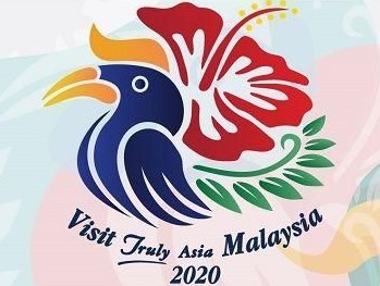
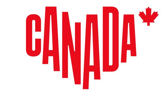
However, sadly, as botanical tourism logos go, the wattle has none of the internationally recognisable characteristics or visual drama of the exotic lotus of Vietnam, the seductive hibiscus of Malaysia, the distinctive maple leaf of Canada, the striking tulip of Turkey, or the bold silver fern of New Zealand. It does, however, obey three of the four basic rules of logo design, which are about impact: it is simple, clean, and visually striking - although the variable sheen, which is presumably meant to convey the lustre of gold, suggests more of an autumnal wilt. Maintaining the visual crispness of all stamens could prove challenging in digital and print reproduction. The fourth rule is more subjective: it should be attractive. Whether or not the wattle ticks this box and amounts to a memorable feast for the eyes or an artistic also-ran, the proof of this pudding will be in its eating over time.
Visualising the Metaphysical
Conveying metaphysical brand values, such as ‘historic’, ‘exhilarating, or ‘innovative’, is a tall order in a logo. The solution frequently lies in depicting, in outline, one or more of the destination’s physical assets that evoke the essence of such values and artistically manipulating them, such as a temple (historic) or a mountain (exhilarating); or in devising an abstract image that can perform the same trick without straining credibility. But, the more abstract, the greater the recognition challenge for strangers to this motif; and the longer it will take for them to clock the association with the country.
Almost invariably, the logo will mean much more to the destination’s residents, particularly those in the tourism and export sectors, not just because they see it more than anyone else, but also because they will have had it explained to them; or at least it is likely to have attracted controversy in local media on its launch. So, encapsulating and communicating a destination’s essence to outsiders in a logo is a Herculean task.
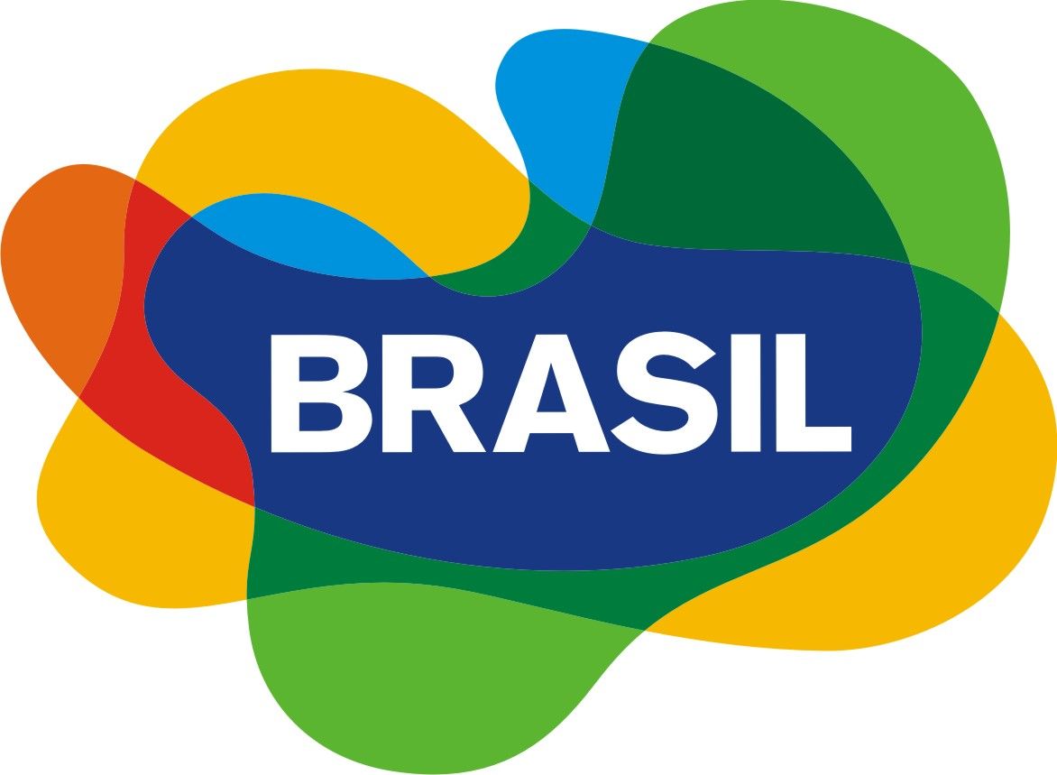
Bridging the gap between metaphysical concept and visual image in a way that achieves indelible impact calls for the ingenuity of Scheherazade and the creativity of Picasso. Destinations that have come close include: Brazil, whose amorphous, abstract shape pulsates with energy and colours that evoke the country’s cultural vibrance and ethnic diversity;
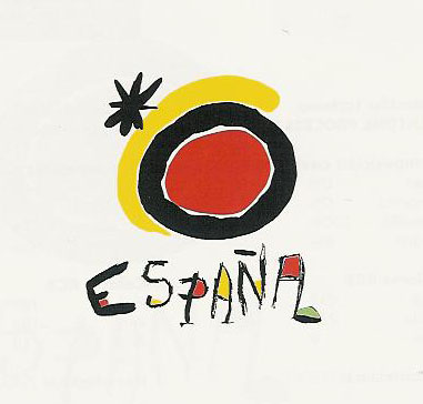
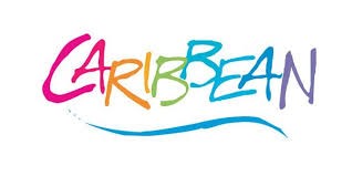
Spain, whose decades old, Miro-designed sun logo is simple, striking, and evocative of the warmth as well as the artistic heritage of the country; the Caribbean Tourism Organisation, whose bright, multi-coloured, undulating wording, underlined by a blue wave, epitomises the sunny, joyful appeal of the region simply and with dazzling clarity. Interestingly, all these logos include the name of the destination in their design. This is no coincidence. A disembodied visual shape will achieve nothing like the traction of one that also proclaims its origin verbally.
Australia’s new logo has dispensed with such verbal identification. But it does still employ abbreviated text: the internet country code for Australia and chemical symbol for gold, “AU”, bursts from the heart of the floret, rendering the overall effect more redolent of a technical, health services, or utilities company, than anything as joyful as tourism, or even agricultural exports. Arcane? Possibly. Intelligible? Hopefully, in time.
Perhaps the most audacious destination logos, which rely on wording alone, while uncompromisingly evoking enduringly iconic elements of the place without resorting to cliché, include:
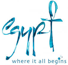
Egypt, whose echoes of hieroglyphics in its customised blue text cleverly say both sea and ancient civilisation; and Paris,
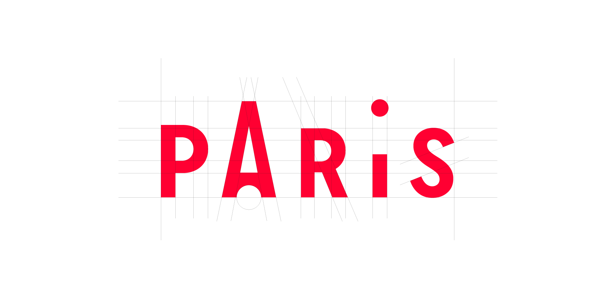
whose almost imperceptible depiction of the Eiffel Tower in the ‘A’ of Paris subtly evokes the effortless style that is integral to Paris’s brand DNA. These all demonstrate that a national icon, no matter how familiar, need never become tired or expressed in a way that allows it to be perceived as a cliché. This goes as much for a tourism destination logo as for an all-embracing national logo.
The Logo Is Dead, Long Live the Logo
A friend of mine in a senior executive position with a major airline once remarked “Don’t be surprised, if you give someone a job to do, they do it”. By this he meant it’s easy for people to get the wrong end of the stick; so, if the brief isn’t clear or they’re given insufficient guidance, they’ll still come up with something, but it may well be a complete dog’s breakfast.
 Ask a team including a creative agency to review a company logo and you’re not going to get anyone saying “the existing logo has enormous cut-through, recognition, and brand equity……..we should hang on to it.” A ‘fresh, up-to-date’ design that represents a ‘new direction’, imbued with ‘vitality and dynamism’ is generally the gist of the new mantra, which implicitly trashes what’s gone before and self-consciously aims to leave clear blue water between the ‘tired’ imagery of the past and the sunlit uplands of a ‘bright new future’, towards which the organisation is valiantly striving with every corporate sinew. Self-justification is all.
These noble aims are invariably reflected in an abstruse explanation by the creative agency of the semiotics behind the newly designed logo – creative rationalisation and designer gobbledygook, which, if they have to be explained, you can bet your house no random consumer or potential visitor is going to grasp in a month of Sundays. Only marketing initiates are programmed to decode logos.
Consequently, it is even more surprising to read the rationalisation for the new Australian logo by a people who are not only amongst the world’s most admirably straightforward and given to calling a spade a shovel, but who generally also instinctively know when to stop digging: “
Our proposed nation brand mark balances a literal and abstract interpretation of a wattle flower. It’s an optimistic burst of gold positivity”. So far so, almost, comprehensible. But then comes the full firehose of creative agency speak: “
The hearty resilience of the wattle has come to represent the enduring spirit of the Australian people. This small, beautiful flower is an organic burst of positivity – in bright joyous gold. It speaks of warmth, expanding ideas and horizons, with the pollen-laden stamens radiating a sense of energy and dynamism. It is an authentic national symbol that is elegantly and undoubtedly Australian.”
You don’t say – you could have knocked me down with a wattle. Somehow, this feels more rooted in wishful thinking than conviction. You can’t help feeling the words had been selected from a lucky dip of corporate jargon to fit whatever the design agency came up with – pure retro-fit; business buzzword bingo.
Cliché or Icon?
Consigning cultural clichés to the rubbish bin of history has its place, not least when they convey an image of a place that has long since changed or never was quite as impossibly romantic or palpably artless as years of popular fiction would have potential visitors believe. Such cultural transgressions are usually the work of previous generations. This allows them to be dismissed as holding the future back. Yesterday’s chic is tomorrow’s kitsch.
But, as a wild species, the kangaroo is no creation of man; it is timeless and above the caprice of fashion. Nowhere else can truly claim the kangaroo as its own. It has no politically unacceptable historical connotations, errs on the side of cuddly rather than grisly, and evokes images of unbridled nature in an increasingly urban world. It screams ‘Australia’ as much as the Sydney Opera House, the New Year fireworks above the Sydney Harbour Bridge, and Bondi beach. Better still, it is not geographically limiting. It is a ubiquitous icon that transcends every corner of the country, recognised, marvelled at, and loved worldwide.
But, its numbers devastated by the recent bushfires, the poor ‘roo is about to be dealt the coup de grace by the hitmen from head office. Despite years of service in which it has endowed Australian marketing efforts with an instantly recognisable, positive, and distinctive edge in a world where most countries would give their right arm to possess such a powerfully unique symbol, the kangaroo logo is hopping towards the creative knackers’ yard. Nevertheless, even after its marketing demise, its spirit will continue to haunt the corridors of consumer consciousness. Where screaming above the crowd is important, the ’roo will still yell for Australia big time. Whether the wattle will remains to be seen.
Keep It Simple
Investing too much time, effort, and money in redesigning a logo is generally a distraction, often counterproductive, and potentially political dynamite, as commentators weigh in with blogs like this, trashing the simplicity of design, accusations about messing with the soul of the nation, and comments such as “my five-year old kid could have done a better job than that”.
It’s no surprise then that Australian commentators have been less than effusive about this bold new symbol to represent their country. Comments, ranging from “how much?!” (A$ 10 million) to pointing out the unfortunate timing in its visual similarity to the COVID-19 virus and worse, were probably to be expected. But, unfortunately, it looks like the brand team gurus have failed the first test of rebranding, which is to take your people with you. If your people are not on board from the start, they can easily derail the train. Subjective rants can be dismissed as unhelpfully aggressive or ill-informed noise. But, more objectively critical reactions, based on experience, deserve listening to. This blog aims to occupy the latter category.
Many years ago, I was involved in the rebranding of Scotland as a tourism destination. This, inevitably, called for a new logo. When the about-to-be-winning agency described their abstract, elemental thistle logo design as containing the colours of Scotland, whereby “
the purple represented the purple of the heather, the green the hills and the fields, and the blue the sea and the sky”, our reaction was “
OK, it’s simple, clean, visually striking, exudes a contemporary feel, and is unequivocally Scottish – we’ll buy it”.

Of course, we understood the rationale behind the colours. But we also understood that only 1 in 100 potential visitors would ever read this symbolism into it. Its visual impact was the winning formula. It had powerful associative and recognition value, both as a distinctively Scottish flower and as a visually striking graphic. And it would only ever pay its way by our consistent and widespread use of it in our and our partners’ marketing communications over the years to come. It still adorns VisitScotland’s marketing materials, road signs, and quality assurance plaques on tourism businesses throughout the country almost thirty years later.
Logo Lifespan

I was once asked by a client country tourism board: “
How long does a destination logo usually last?”………”
The tenure of one chief executive” was my knee-jerk response. My answer was informed as much by empirical observation as it was cynical. This was because destination rebranding became very fashionable for several years amongst tourism boards, usually as soon as a new CEO hit the desk.
Announcing an intention to rebrand signals a clear ambition to split from the past, forge a new path for the destination, and marks out the new incumbent as suitably dynamic. A new logo is the epitome of this fresh direction and a clear indication to politicians, the media, and the tourism industry that things are changing, even if they aren’t.
There are no hard and fast rules about lifespan. However, it’s interesting to note some of the most widely recognised logos in the world are amongst the longest running: Spain (tourism) – almost 40 years; and Shell – over 115 years.
The Creative Challenge: Innovation vs. Integrity
Clearly the weight of expectations on the shoulders of a creative agency to come up with the visual equivalent of a volcanic eruption is enormous. A new logo has to be quite different and completely dissociated from the past. Otherwise creative reputation and professional pride are at stake. No creative agency gets any kudos for recommending the status quo when asked to design a new logo, even if its designers believe in their heart of hearts the current logo is strategically and emblematically streets ahead of anything they can come up with (well, maybe Shell is an exception). So, the scene is set for change, regardless of reason.

But sometimes reason prevails over an unwarranted appetite for change. Several years ago, I worked on a rebranding project for a well-known UK regional destination. Part of the brief was to come up with a new name for the area. We scratched our collective heads for ages trying to think of a name that was both more appropriately descriptive and compelling. We couldn’t.
Extensive consumer perception research had enabled us to identify a clear set of destination brand values. But we were forced to admit the existing name couldn’t be bettered. But how would the client react to this? They’d asked us to find a new name for the area. How could we justify going back to them, after they’d spent so much money – and how could they face their stakeholders and constituents – if we merely said “keep your existing name, because it works and anything else would be a poor second”?
After much soul-searching, we decided the destination’s reputation and our professional integrity were more important than any short-term kudos that might come from slaking a thirst for change. So we recommended they keep the name. Fortunately, after they got over the initial shock, they found the courage to buy it. The region still goes by the same name thirteen years later.
This was a buttock-clenching lesson in professional integrity. Honest analysis, rooted in consumer insight, trumps any notion of painting a go-faster stripe down the side of a destination in a forlorn attempt to create the illusion of change. That is not to say change is never warranted, just that marketing rationale should be the driving reason, not change for change’s sake, or worse – corporate ego.
Listen to the Market
None of this commentary is intended to impugn the integrity of the group that decided to ditch the ’roo in favour of the wattle. It is merely a personal opinion, informed by my own experience. That is all it ever can be.

Presumably, the new wattle logo was tested for impact and resonance in some of Australia’s key overseas markets, and the resultant data endorsed this new direction. Similarly, I expect consumer insights must have revealed adverse or burnt-out associations with the kangaroo, which will have provided compelling evidence of the need for change. And I imagine the notion has been dismissed of giving Skippy a brush-up and makeover to make him more millennial-friendly, as Shell has done over the decades to ensure its enduring scallop shell keeps pace with contemporary design trends.
Hopefully, this decision has been informed by such consumer insight and this is not just a case of residents’ logo fatigue, devoid of market insight. Otherwise, therein would lie the danger of being subject to personal prejudice and political whim, rather than market logic.
Talking to yourself has never been a wise marketing tactic. I once had a boss, when I was International Marketing Director at the Scottish Tourist Board, who told me to “
get rid of that bloody castle” we featured in much of our advertising, because “
I’m fed up with it”. We probably all were. We were so familiar with it, it felt like an old slipper.
But, as I explained to him, what we thought was of no consequence. We weren’t the target audience. We may have been exposed to it day in-day out. But most of our audiences around the world probably had no more than 3-5 opportunities to see (OTS) it, which was barely enough to drive recall, let alone inspire booking. But our research told us this type of imagery worked, both in evoking positive associations with Scotland and in carving out a competitively distinctive position for Scotland as a tourism destination. And that’s what mattered. Our perspectives were irrelevant.
Robert Burns perfectly articulated one of the first principles of marketing, when he stressed the need “tae see oorsels as ithers see us” (to see ourselves as others see us) in his poem “To a Louse”. That’s why we marketeers undertake so much consumer perception research – to get as close as we can to seeing our destination and our competitors through the eyes of our target markets. If we fail to do this, all subsequent marketing activity will be futile: like throwing darts blindfold, the chances of hitting our target will be dependent on luck, not judgement.
I can only wish Australia every success with its new logo. It is an awesome country. It has long punched above its weight on the world stage for a country of c. 25 million people so far from so many major markets.

It deserves its tourism prosperity, which stems from the reputation of its friendly, straight-talking people, adventurous character, magnificent scenery, and cultural cauldron, not to forget years of great work done by Tourism Australia to establish the country firmly on the international visitor map of the world. Whatever the fortunes of the new logo, these hardy destination assets and positive global awareness will stand Australia in great stead for years to come.
Maybe no-one will notice the kangaroo is gone and the little-known wattle may, in time, become as recognised worldwide as the symbol of Australia as the silver fern is of New Zealand. I, however, will remember it for two reasons: firstly, as a result of my surprise at the jettison of years of accumulated brand recognition value embodied in the kangaroo logo, and in the choice of such an internationally unknown symbol to replace the kangaroo to represent a nation; and, secondly, through phonic association with Aussie hospitality, as in the first question my Aussie friends ask of a mate walking into a bar: “wattle (sic) it be?”.
But I’ll struggle to dissociate Australia from that exuberant and irrepressibly amiable kangaroo, which, just like current assertions of the wattle’s new-found resonance,
“speaks of warmth, …..radiating a sense of energy and dynamism” as “an authentic national symbol that is elegantly and undoubtedly Australian”.
So long Skippy. You did a great job. You’ve earned your retirement. RIP.

June 2020